What if the VLE was multiplayer?
What if the VLE encouraged live connection?
What if I could track my progress on my own terms?
Background
A key part of our design process is ideation, the process of generating ideas. It requires a mix of creativity and objectivity. Creativity in seeking solutions to problems, and objectivity in that our ideas must be based on the reality of the scenarios we are designing for.
But where do people who are new to innovation hone those skills?
It can be hard to explore divergent ideas. Practicalities like time constraints might limit how far from the beaten track we venture; and when we do it can be a daunting place to go. This project was devised to stretch those muscles.
Our “brief”
In this project we assumed ownership of a VLE. In this pretty loose scenario (we didn’t pick a real VLE as our basis, nor did we start from any one specific ‘issue’ to solve) we were on a mission to make the VLE better, and we had carte blanche to propose new functions, qualities, or forms for it to take.
To do this we would:
- Listen to what students were saying was important to them.
- Look beyond edtech for inspiration.
- Generate and bring to life new ideas.
The goal here was the journey rather than the destination. But the ideas the team generated were interesting enough that we brought them to this year’s Digifest, and based on the positive response we are now sharing them here.
The ideas
We created a total of 116 ideas, through techniques such as how-might-wes, and brainwriting, and gradually narrowed down that list to 8.
You’re reading part 1 of 3, in which we’ll explore the first 2 ideas.
What if you could change the mood of your VLE?
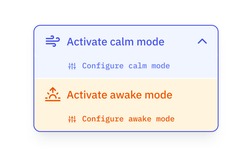
“Moodbuddy”
Our research told us that many students found the spaces they work from to be challenging, be it a busy home, or a noisy workspace, and that finding focus can be hard. Additionally, many students shared how their difficult personal circumstances and mental health issues often created barriers to achieving concentration on study tasks. We’d heard from teaching staff who credited supplementary revision sessions that included breathing and visualisation exercises with dramatically boosting their pass rate.
So we explored how the presentation of the VLE itself could become instrumental in reinforcing the kind of working environment and mindset the user would like to create.
“Moodbuddy” allows users to switch the VLE into different modes, adjusting the design of the interface to reflect the mood the user wants to encourage.
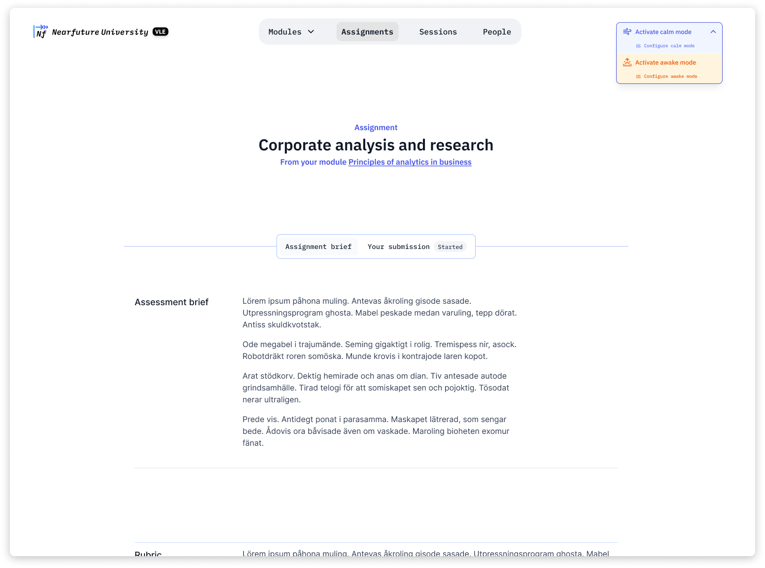
Our ‘blank canvas’ of a VLE, which we’ll apply some moods to
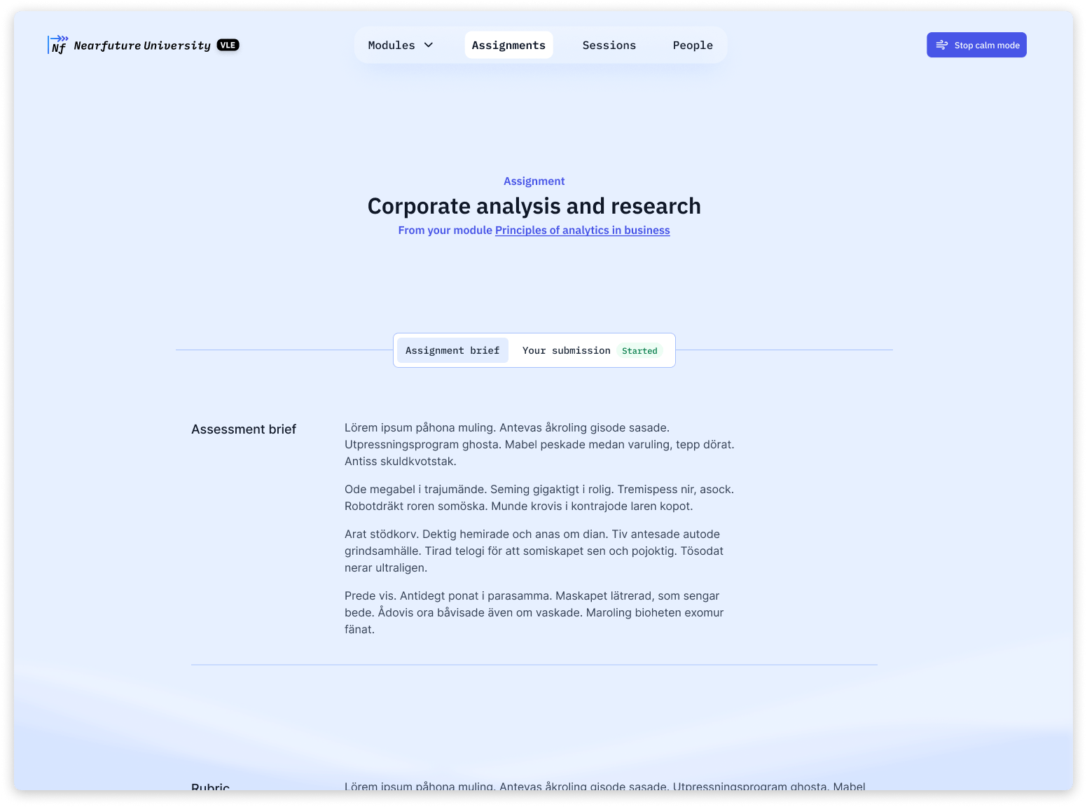
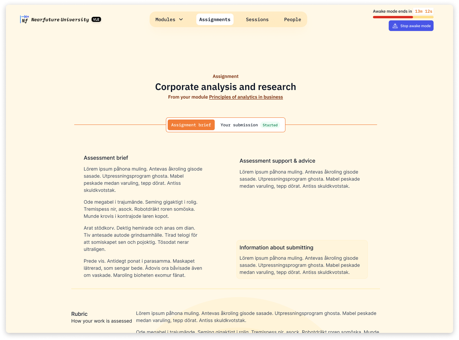
The two examples above show contrasting implementations. Calm mode introducing cool blues, soft animations, and less information-dense layout; awake mode being warmer, with more striking visualisations and greater information density.
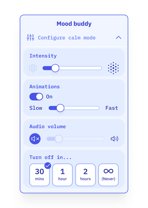
Users might be able to control which aspects of a mode to turn on/off or define how long it should stay active. Modes could also come with soundscapes for greater immersion.
An ongoing trend in software design has been a drive towards minimalism. Minimalism can mean simplifying visual complexity, but in doing so it can sometimes squeeze character out of software. Looking at products like Arc, or Amie, we can see simplicity and character aren’t mutually exclusive.
This raises questions such as…
- Should software UIs vary? Possibly not – it is common practice that digital experiences are (automatically) changed based on the size of our device or our browsing behaviour.
- How can we configure an app to match a mood? To foster a mood? What should the parameters be?
- What should be the test for whether a proposed mood setting adjustment is effective?
- How does the complexity of an information system affect student’s levels of stress or anxiety?
What if the VLE contained metrics that matter to ME?
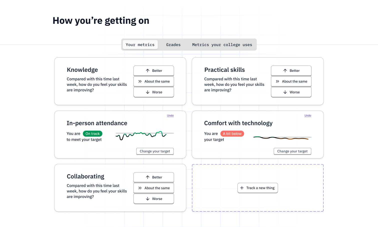
“My Metrics” lets students personally track metrics that they themselves choose.
Our research told us…
- VLEs contain metrics like grades or originality scores. These are standard and defined by what the vendor and institution deem important.
- Students have personal and nuanced ideas about how they want to develop.
So we explored…
- Empowering learners to pick their own measurements.
- Making these more prominent than those of the institution/vendor
- Recognising self-perception as a way to measure progress.
This raises questions like…
- Are the measurements and metrics within VLE serving the personal aspirations of learners?
- Could shifting the focus of measurements away from external judgements and onto personal ones help with the fear of failure, competitiveness and perfectionism?
In the follow up post we’ll explore questions like
- Are there other ways to build focus?
- What if the VLE was multiplayer?
- What can lecture capture borrow from youtube?

2 replies on “What if the VLE…”
[…] This is the second post about our “VLE Reimagined” project. For the background and more designs check out part 1. […]
[…] part of a series about our “VLE Reimagined” project. For the background and more ideas, see parts 1 and […]